Data Visualization
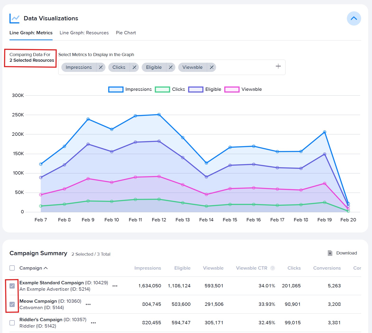
Line Graph: Metrics
This graph lets you compare a selected group of resources based on stats metrics. All resources are compared by default.
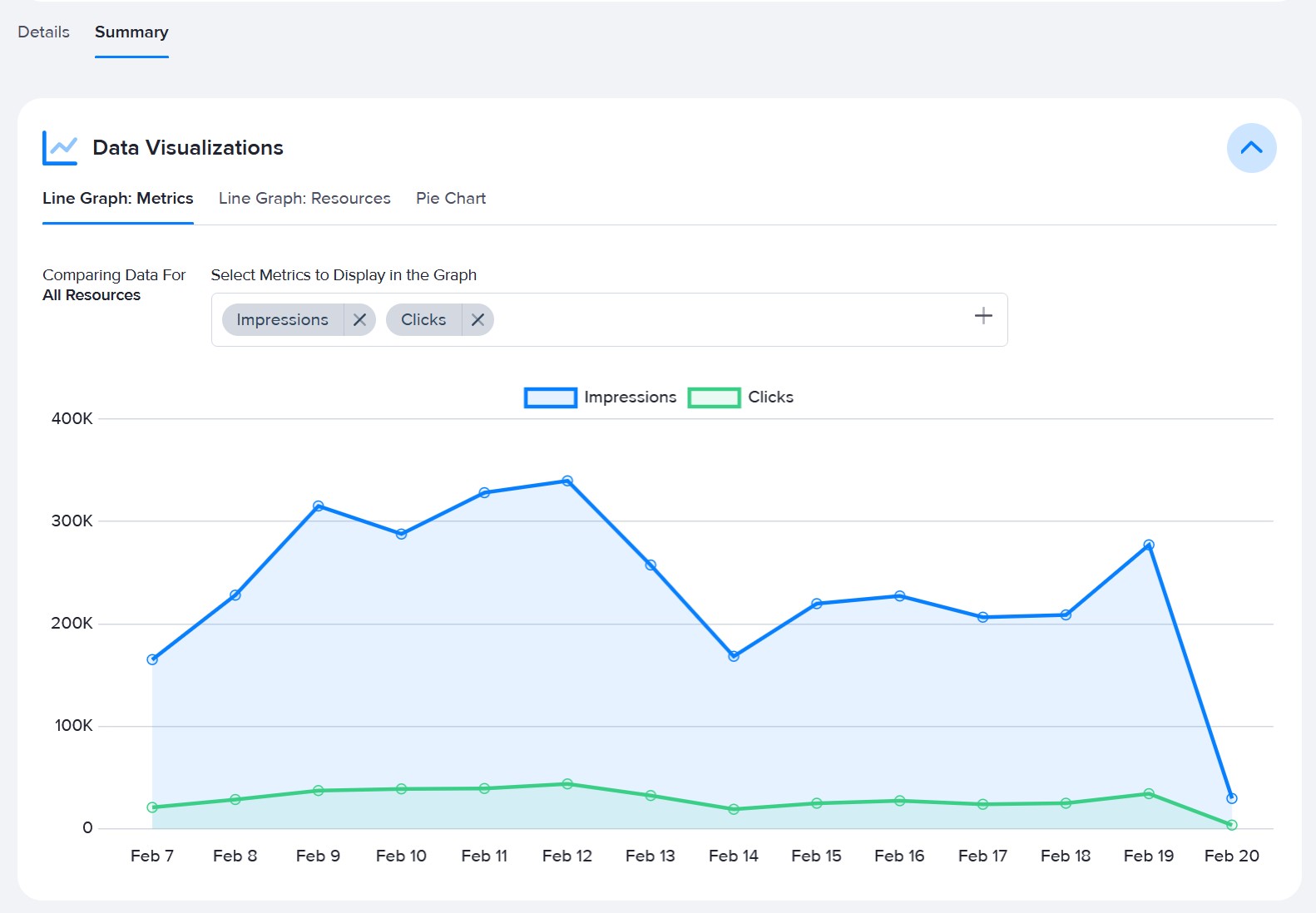
To refine the data, select resources from the summary table to sum their data and compare in the graph.
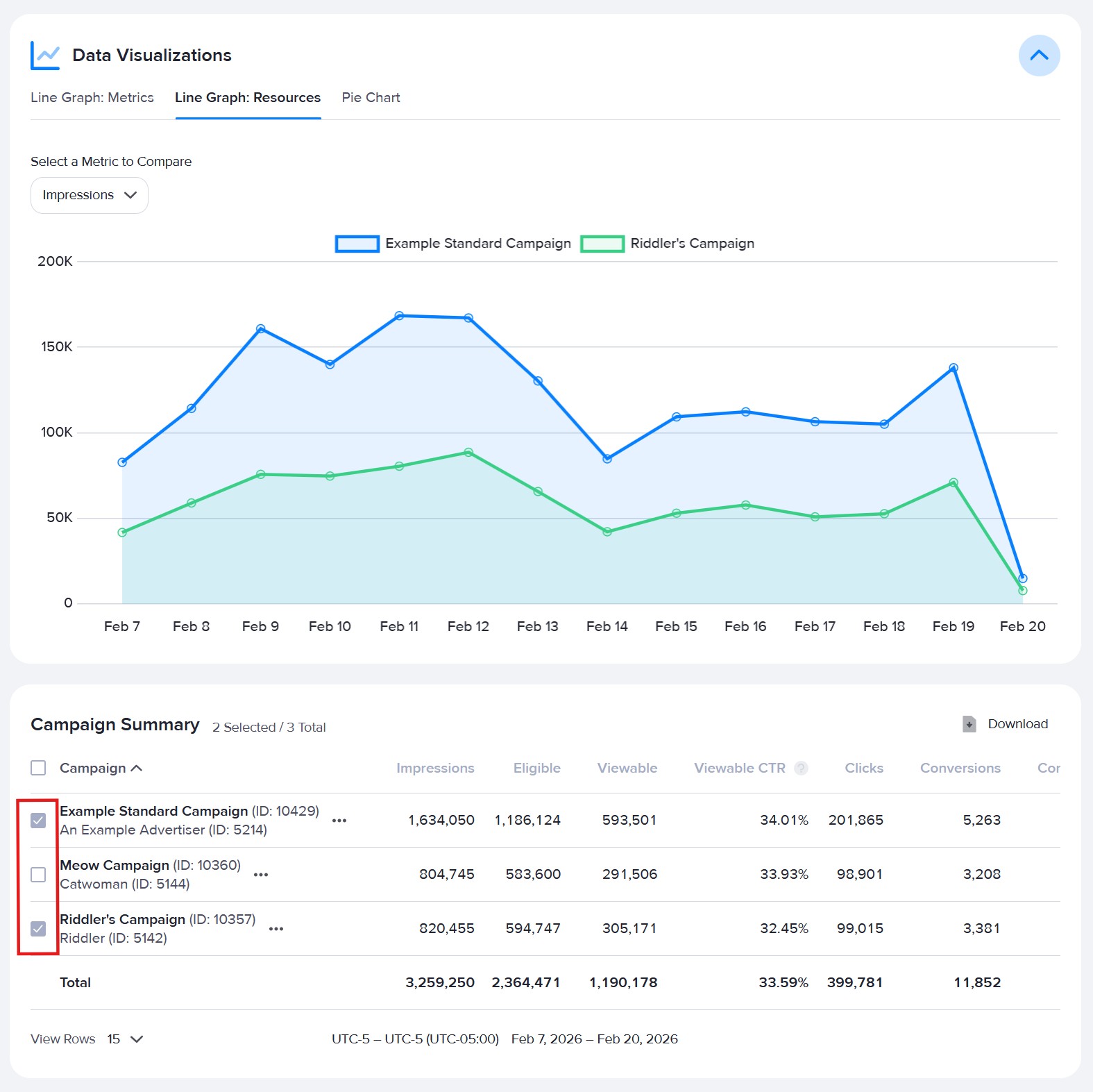
Line Graph: Resources
This graph lets you compare a selected group of resources based on a single metric. No visualization will be shown until resources are selected from the summary table. Use the drop-down to select which metric you want to compare the resources by.
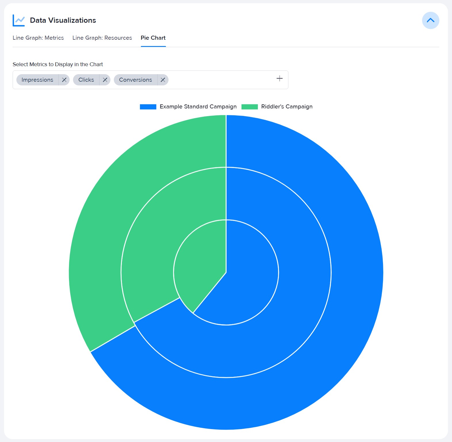
Pie Chart
This graph lets you compare selected resources and metrics. No visualization will be shown until resources are selected from the summary table. Select up to four metrics to compare resources by at a time.